RE: Help with our website! what do you think?
(Edited)
You are viewing a single comment's thread:
First of all, I am not saying that the site doesn't look cool. It's simple and clean. There are just a few things I have noticed.
I think it will look much better if the white spaces are not to big
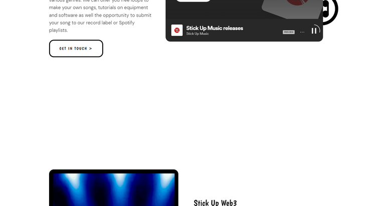
Desktop View
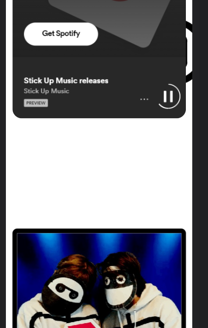
Mobile View
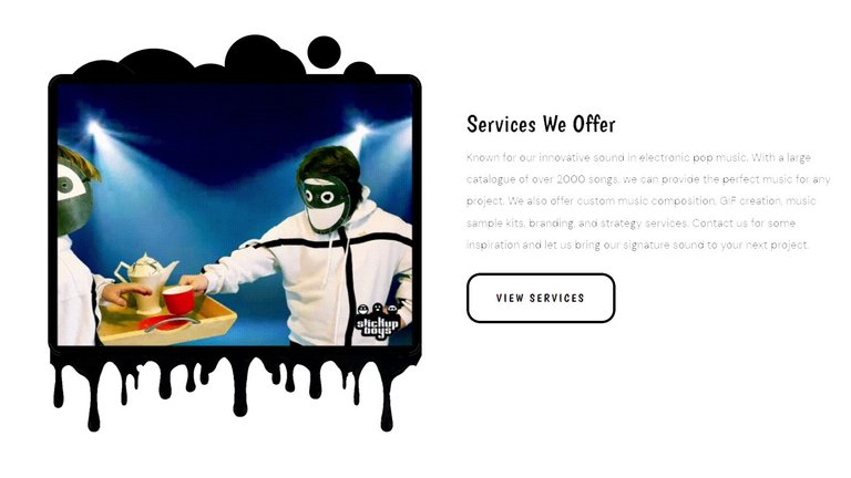
Just an idea, can't you make the frames irregular? I think something like this would match your fun character.
BTW I Love the Animations. :)
0
0
0.000
oh nice ideas! i think on the spaces there are ads as we are trying to monatise our website a bit! but the frames would be interesting! thank you for the support and ideas!
Oh, I see. Yeah, it's good to put ads in those spaces. Good luck Guys! :)
Yes, sometimes Google doesn't display the ads (depends on user and if you're using an adblock) but there should usually be some ads in those whitespaces you see... I might need to do something with JS where if no ad is shown then display:none; type thing. Thanks for the feedback, much appreciated and love the idea of the frames around the images.
Thanks for appreciating my idea. :) BTW those peeping images behind the frame looks cool!:)
I like this idea a lot.... what are your thoughts to doing something like this @stickupboys ?
good idea!