Making my musical banner | Haciéndome un banner musical
ENGLISH|ESPAÑOL
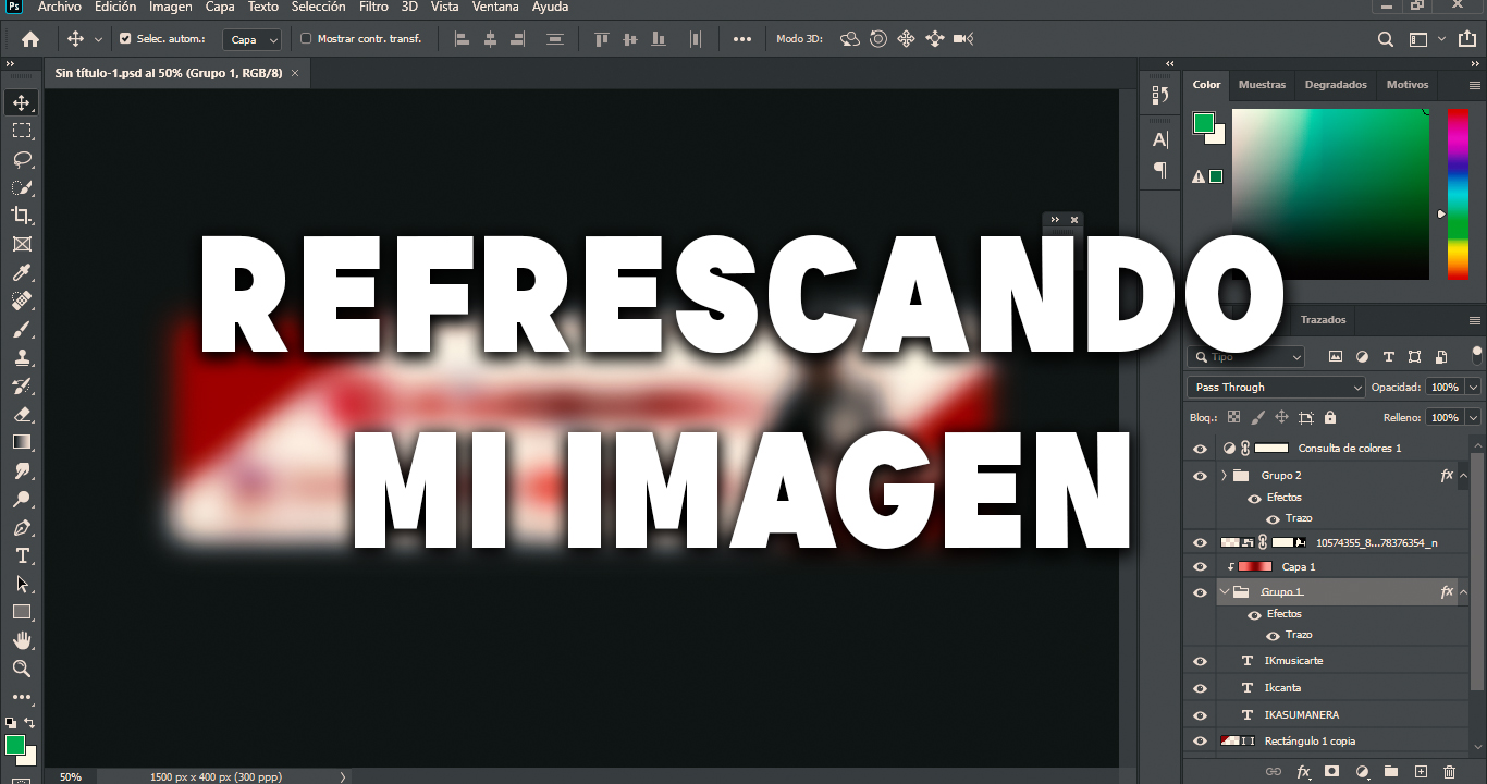
Hellooo everyone today I bring something different, if you have followed me for some time already know that I follow a kind of format for my publications due to recommendations and other circumstances that led me to settle in a format that worked for me and although I did not consider anything special at least it was functional, and now that some time has passed I got bored of it so I decided to give a refresh to my publications and for this I created a banner for the end of my publications and a separator that is always useful, now I will tell you how the process was Let's go for it!
Muy buenas a todos hoy traigo algo distinto, si me habéis seguido desde hace algún tiempo ya saben que sigo una especie de formato para mis publicaciones debido a recomendaciones y otras circunstancias que me llevaron a acomodarme en un formato que me funcionaba y aunque no lo consideraba nada especial al menos era funcional, ya ahora que ha pasado un tiempo me aburrí de ella por lo que he decido darle un refresco a mis publicaciones y para ello he creado un banner para el final de mis publicaciones y un separador que siempre es útil, ahora les contare de como fue el proceso ¡Vamos a por ello!
The first thing to do this kind of things is the idea and I had it very clear in my mind, I want to focus on music and beautify the publications, so I had to show myself in my facet as a musician and use colors that seemed to me to match with the available interfaces of HIVE although it is impossible to please everyone at least that I was satisfied would be fine, I trusted my judgment after so long working as a designer, starting from that began my journey of what to do.
Lo primero al hacer este tipo de cosas es la idea y yo la tenia muy claro en la mente, quiero centrarme en la música y en embellecer las publicaciones, así que tenia que mostrarme en mi faceta de músico y utilizar colores que me parecieran compaginaran con las interfaces disponibles de HIVE aunque es imposible complacer a todos al menos con que yo estuviera conforme estaría bien, confió en mi juicio luego de tanto tiempo trabajando como diseñador, partiendo de eso empezó mi travesía de que hacer.

One of the big problems when doing this kind of things is that there are many interfaces and what is really complicated is that it looks good in both dark mode and light mode, so the design should have an intense color and a light color, white and red wine seemed fine to me so I started from that basis.
Uno de los grandes problemas que hay al hacer este tipo de cosas es que hay muchas interfaces y lo que realmente es complicado es que se vea bien tanto en modo oscuro como en modo claro, por lo que el diseño debería tener un color intenso y otro claro, blanco y vino tinto me pareció bien por lo que partí de esa base.

I added some notes in the background so it wouldn't be completely monotonous and I made it clear that the music was going to be present in the root as well as with me.
Agregue unas notas al fondo para que no sea del todo monótono y desde ya dejando claro que la música iba a estar presente en la raíz al igual que conmigo.
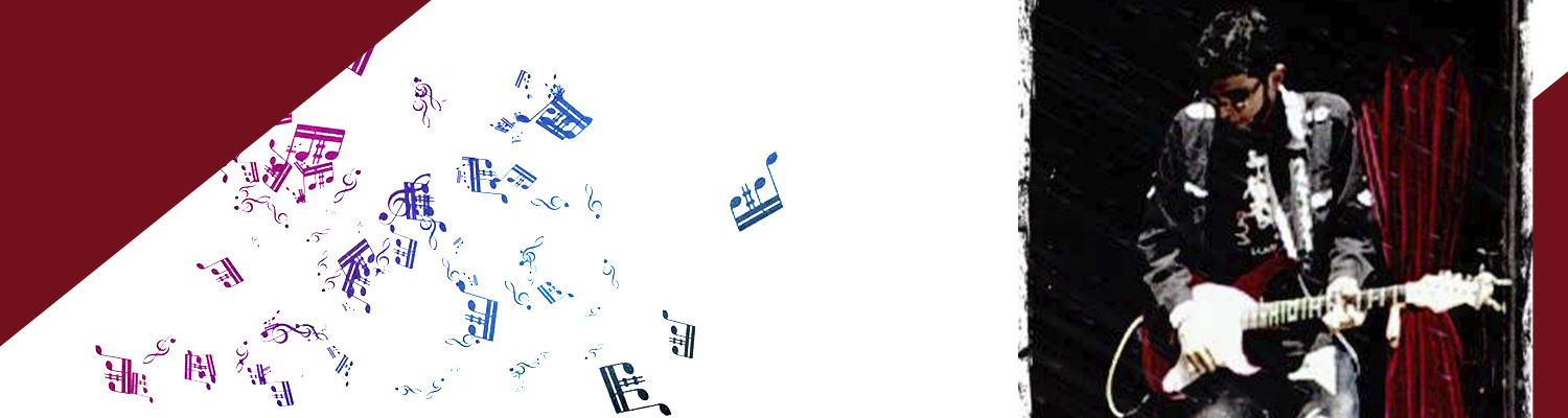
Then I spent a long time looking for an image that was in my memory in which I had a guitar in vinotint that I knew would fit very well in the composition, until I found it and placed it in its position.
Luego pase un buen tiempo buscando una imagen que estaba en mi memoria en la cual tenia una guitarra en vinotinto que sabia encajaría muy bien en la composición, hasta que la encontré y la coloque en su posición.
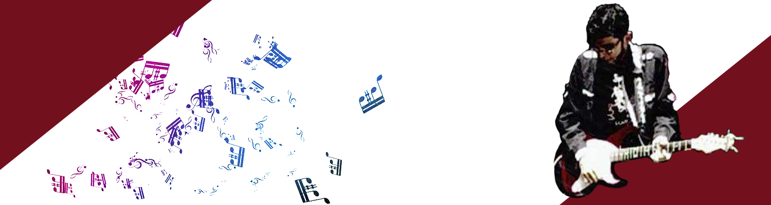
After placing it in its place I only had to cut it, this is a tedious process because to make it perfect I had to do it manually since most of the image was black and the tools that facilitate these processes do not get along very well with this type of images.
Luego de colocarla en su sitio solo me quedaba recortarla, este es un proceso tedioso porque para que quede perfecta debía hacerlo manual ya que en su mayoría la imagen era negra y las herramientas que facilitan estos procesos no se llevan muy bien con este tipo de imágenes.
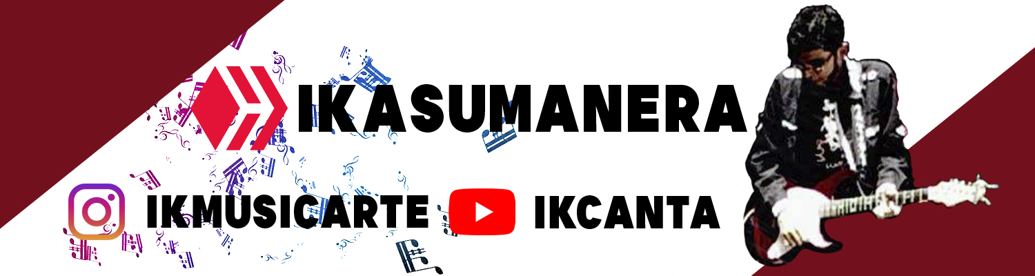
Now something that should never be missing is the functional part that will help those who want to know more about me to locate me in the networks where I move the most.
Ahora algo que cero que nunca debe faltar es la parte funcional que ayudara a que los que quieran saber mas de mi me puedan ubicar en las redes donde mas me muevo.
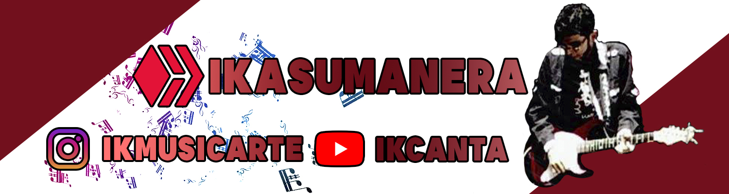
I personally like to put a border on the letters and logos to highlight them more, this is not always recommended but as I said here I try to make it look good on the white so this helps a lot.
A mi personalmente me gusta colocarle un borde a las letras y los logos para resaltarlos mas, esto no siempre es recomendable pero como ya les dije acá trato de que se vea bien sobre el blanco por lo que esto ayuda mucho.
To finish I worked a little more colors to give a little more vivid tone in general and took the opportunity to focus a little more text and logos, I loved it is difficult to make the white look good especially in peakd so I feel it is a completed achievement, from now on this image will accompany the end of my music posts Yes! And as always thank you very much for the support and see you next time.
Para terminar le trabaje un poco mas los colores para darle un tono un poco mas vivo en general y aproveche para centrar un poco mas el texto y logos, a mi me ha encantado es difícil hacer que el blanco quede bien en especial en peakd por lo que siento que es un logro completado, de ahora en adelante esta imagen acompañara los finales de mis post musicales ¡Si! Y como siempre muchas gracias por el apoyo y hasta la próxima.
0 comments